PICC Risk Management System
PICC Risk Management System
Enterprise SaaS redesign for China's largest insurer. PICC's approval system was fully functional — but built around data presentation, not decision-making. An eight-month project that cut approval cycle time by 42% after launch.
Enterprise SaaS redesign for China’s largest insurer. PICC’s approval system was fully functional — but built around data presentation, not decision-making. An eight-month project that cut approval cycle time by 42% after launch.
Client
PICC · Fortune Global 500
Role
Product Designer (independent lead)
Team
1 PM · 1 Designer · 30+ Engineers
Duration
8 Months
Client
PICC · Fortune Global 500
Role
Product Designer
Team
1 PM · 1 Designer · 30+ Engineers
Duration
2023.01-2023.08
A system built around modules
— not around people.
A system built around modules
— not around people.
The client came to us with a one-line ask: "Our system is inefficient. We need an upgrade." Before touching any design, we spent a week shadowing reviewers — the people who sit inside the system eight hours a day, deciding whether to continue, adjust, or cancel coverage for companies flagged by PICC's risk engine.
The client came to us with a one-line ask: “Our system is inefficient. We need an upgrade.” Before touching any design, we spent a week shadowing reviewers — the people who sit inside the system eight hours a day, deciding whether to continue, adjust, or cancel coverage for companies flagged by PICC’s risk engine.
We assumed the problem was a few specific features. After spending real time with users, the issue ran deeper: the system had been built around functional modules, not around how reviewers actually work.
We assumed the problem was a few specific features. After spending real time with users, the issue ran deeper: the system had been built around functional modules, not around how reviewers actually work.
The Problem
Not a missing feature. A missing point of view.
Not a missing feature. A missing point of view.
A reviewer's day comes down to three decisions, repeated hundreds of
times a week: find the right task, make the right judgment, and know
what happened after submission. The system had a feature for each —
but none of them were built around how reviewers actually work.
A reviewer’s day comes down to three decisions, repeated hundreds of times a week: find the right task, make the right judgment, and know what happened after submission. The system had a feature for each — but none of them were built around how reviewers actually work.
01
01
Finding the task
Finding the task
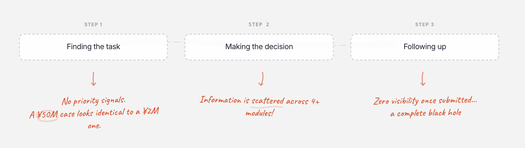
Flat queue, no priority signals. A ¥50M policy looked identical to a ¥2M one. Critical cases got buried by accident.
Flat queue, no priority signals. A ¥50M policy looked identical to a ¥2M one. Critical cases got buried by accident.
02
02
Making the decision
Making the decision
Information scattered across 4+ modules. Every decision started with a search, not an evaluation.
Information scattered across 4+ modules. Every decision started with a search, not an evaluation.
03
03
Following up
Following up
Once submitted, the case went dark. No visibility, no record — just offline follow-up and anxiety.
Once submitted, the case went dark. No visibility, no record — just offline follow-up and anxiety.
"Critical cases keep getting buried.
Processing windows are missed.
These are losses that should have been
avoidable."
“Critical cases keep getting buried.
Processing windows are missed.
These are losses that should have been
avoidable.”
— Raised at every quarterly review
core principle.
Align the system's organizational logic with the reviewer's decision-making logic.
Align the system’s organizational logic with the reviewer’s decision-making logic.
Intervention · 01
Priority, redefined from the data up.
Priority, redefined from the data up.
The initial direction, proposed by the PM, was to sort by the existing trigger severity tags, high to low.
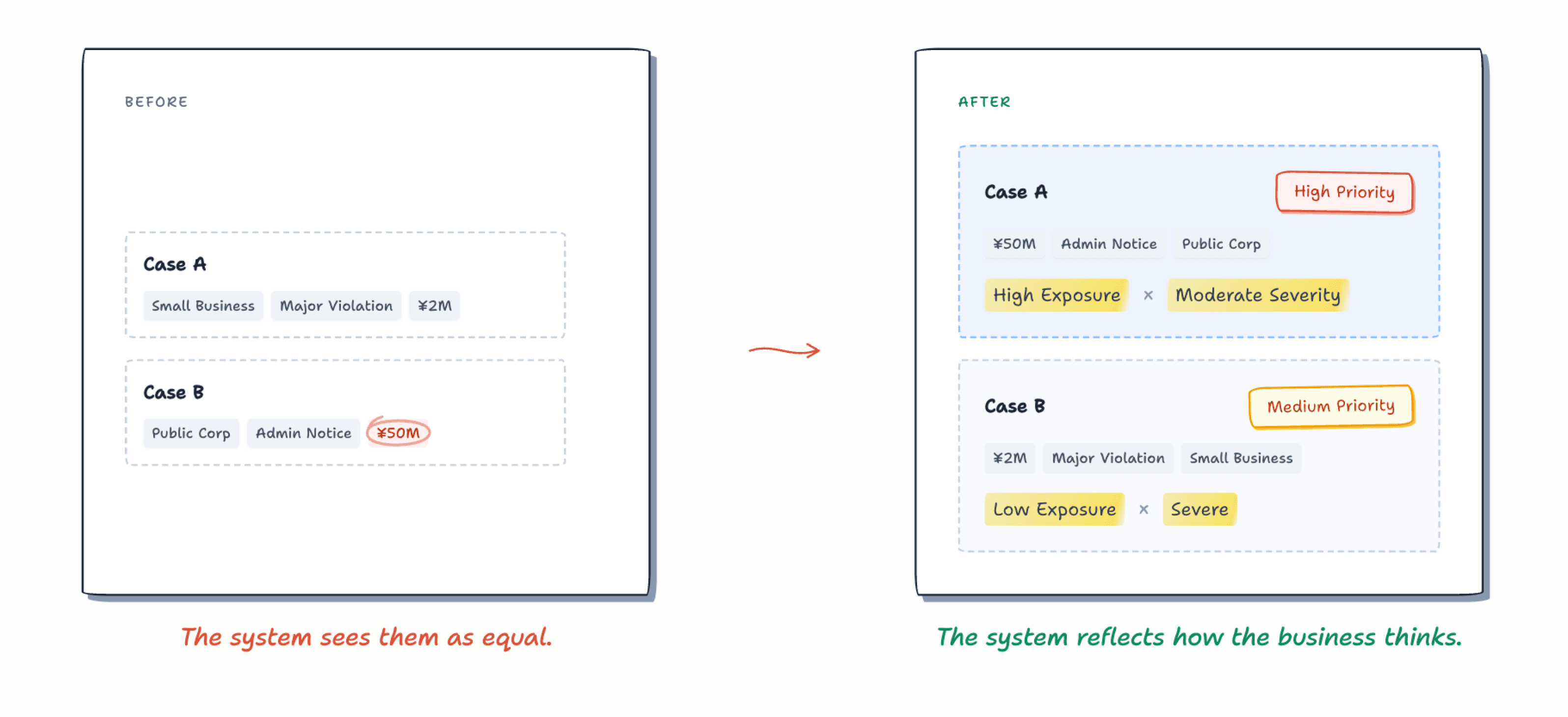
But walking through real cases with a client relationship manager, the logic fell apart. A minor administrative notice from a listed company and a major violation from a small regional business could both be labeled "high." But the first involved ¥50M in coverage. The second, only ¥2M.
The initial direction, proposed by the PM, was to sort by the existing trigger severity tags, high to low.
But walking through real cases with a client relationship manager, the logic fell apart. A minor administrative notice from a listed company and a major violation from a small regional business could both be labeled “high.” But the first involved ¥50M in coverage. The second, only ¥2M.
Trigger severity wasn't the same as business urgency. I brought this finding back to the team and pushed to reframe the question:
what actually determines how urgent a case is?
After working through real cases with the PM, the data analyst, and business managers, we settled on two dimensions:
policy exposure × trigger severity.
The data team translated this into a composite priority matrix, with the system calculating a priority score for every case on entry.
Trigger severity wasn’t the same as business urgency. I brought this finding back to the team and pushed to reframe the question:
what actually determines how urgent a case is?
After working through real cases with the PM, the data analyst, and business managers, we settled on two dimensions:
policy exposure × trigger severity.
The data team translated this into a composite priority matrix, with the system calculating a priority score for every case on entry.
Priority Matrix
Policy Exposure
Severe
Moderate
Advisory
>¥50M
High
High
Low
¥5M – ¥50M
High
Medium
Low
¥1M – ¥5M
High
Low
Low
<¥1M
High
Low
Low
With the rules in place, the task list design could actually begin.
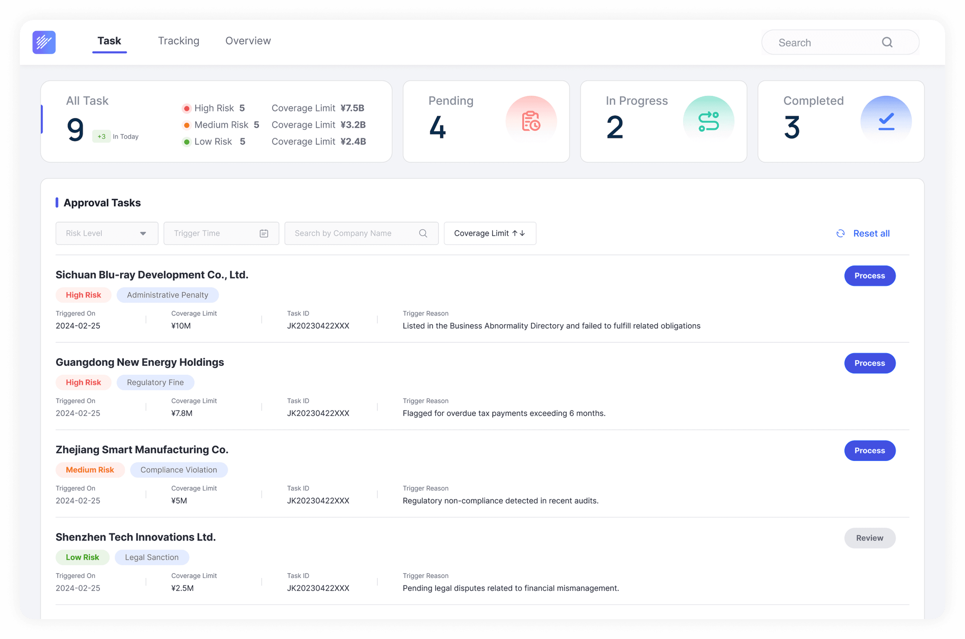
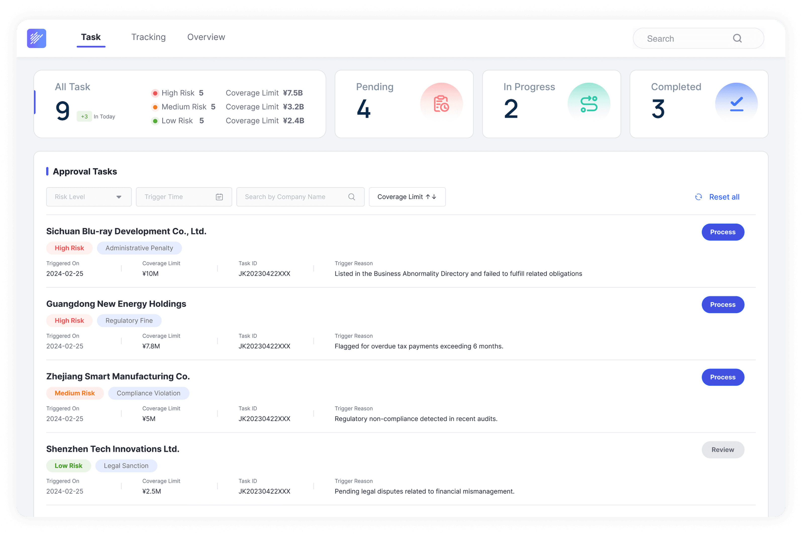
Tasks now sort automatically by composite priority, with high-risk cases pinned to the top. Each row carries a priority tag, differentiated by color and shape. Action paths are also tiered: high-risk cases go through a full approval flow, while low-risk ones need only a Quick Review.
With the rules in place, the task list design could actually begin.
Tasks now sort automatically by composite priority, with high-risk cases pinned to the top. Each row carries a priority tag, differentiated by color and shape. Action paths are also tiered: high-risk cases go through a full approval flow, while low-risk ones need only a Quick Review.
Intervention · 02
One view. Everything needed to decide.
One view. Everything needed to decide.
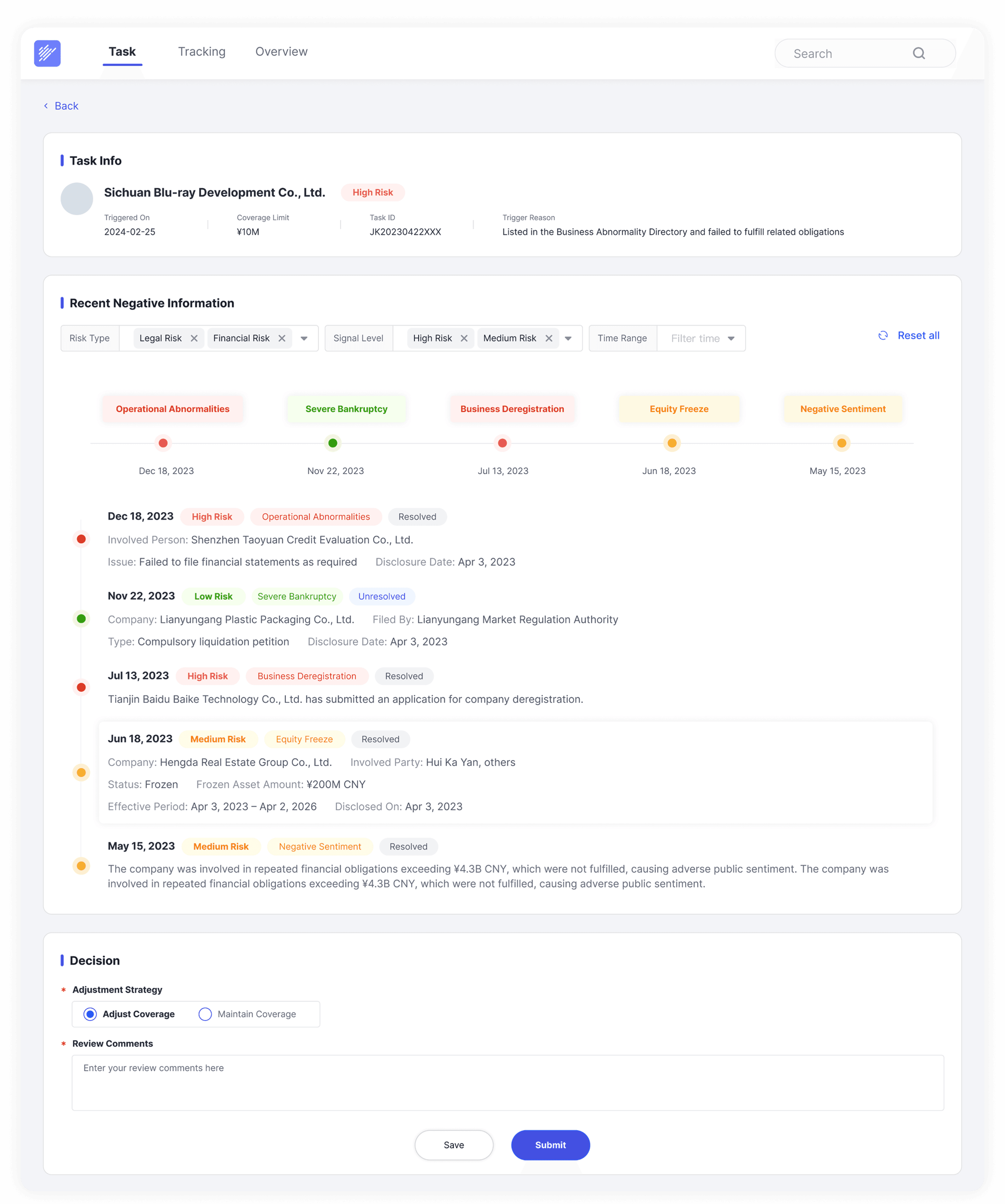
Before: six tabs and a mental map to hold the picture together. After: one
page. Company profile, trigger reason, a system-aggregated timeline of
negative signals, and a stripped-down decision form — all in one place.
Before: six tabs and a mental map to hold the picture together. After: one page. Company profile, trigger reason, a system-aggregated timeline of
negative signals, and a stripped-down decision form — all in one place.
Before
Context was split across six separate pages. Every review started with tab-switching and mental re-assembly. Users described it as "holding a jigsaw puzzle together in your head."
Context was split across six separate pages. Every review started with tab-switching and mental re-assembly. Users described it as “holding a jigsaw puzzle together in your head.”
"I have to remember six things at once just to start." — ~24 min per case gathering context
“I have to remember six things at once just to start.”
— ~24 min per case gathering context
After
One consolidated view. Company info, aggregated negative-signal timeline, trigger reason, and a decision form — a single scroll. Every field had to earn its place.
The system now pulls signals from every legacy source into a single filterable timeline reviewers can scan in seconds.
Intervention · 03
Accountability without the anxiety.
Accountability without the anxiety.
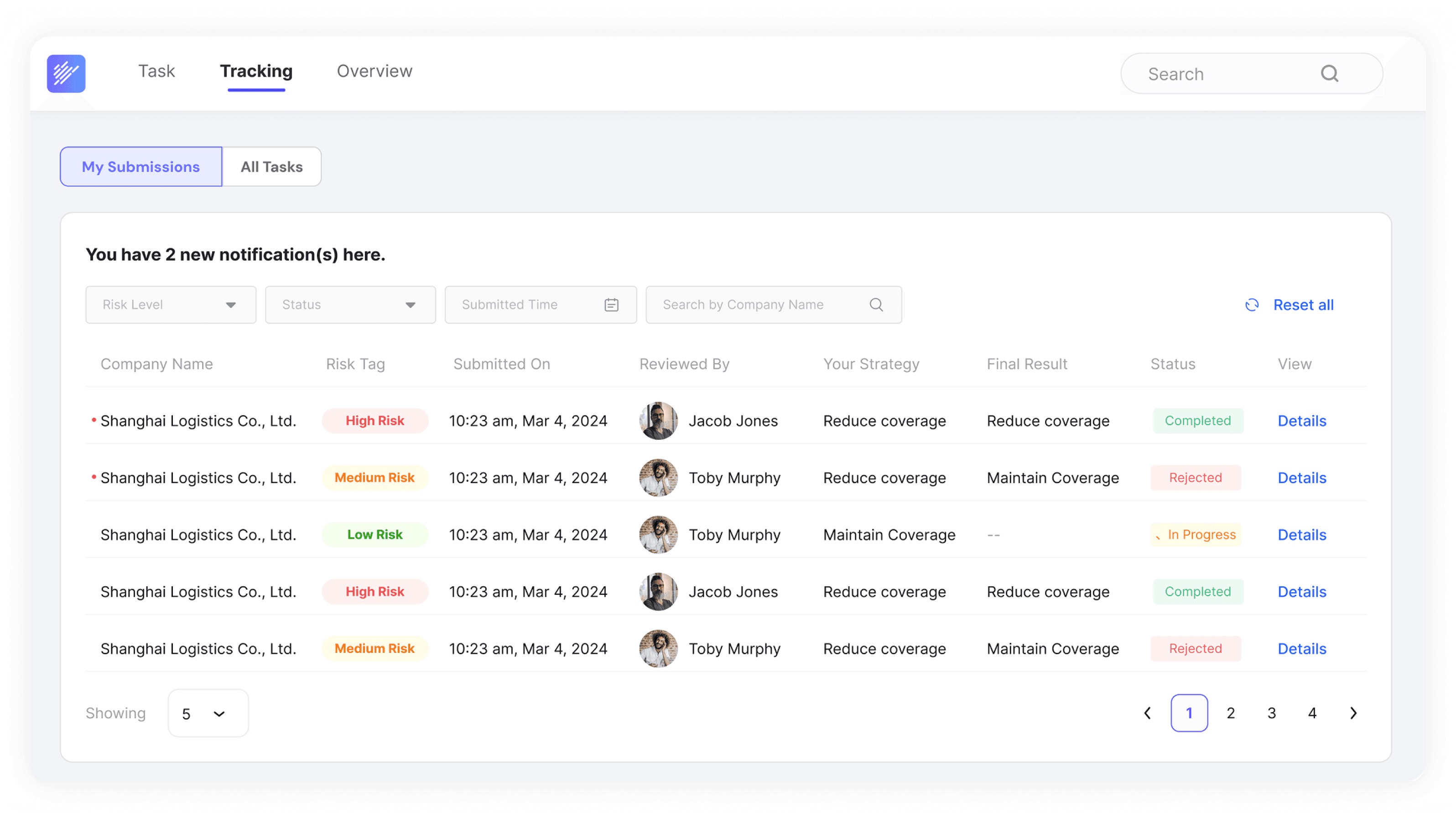
Submission isn't the end of a reviewer's relationship with a case — they
carry accountability for every decision. The new My Submissions view
gives them a complete record.
Submission isn’t the end of a reviewer’s relationship with a case — they carry accountability for every decision. The new My Submissions view gives them a complete record.
Before
After submission, the case disappeared. No route-of-review, no
outcome visibility. Reviewers only heard back when something
was rejected — often weeks later, in a group chat.
After submission, the case disappeared. No route-of-review, no outcome visibility. Reviewers only heard back when something was rejected — often weeks later, in a group chat.
"After I submit, it's silent — until someone rejects me."
“After I submit, it’s silent — until someone rejects me.”
After
A full record, always in reach. Who's reviewing each case, what strategy was recommended, and where it ended up. No more
offline chasing.
A full record, always in reach. Who’s reviewing each case, what strategy was recommended, and where it ended up. No more offline chasing.
Reviewers can check any submitted case at any time, without waiting
for a rejection notice.
Reviewers can check any submitted case at any time, without waiting for a rejection notice.
Outcome · 1,000+ Reviewers · PICC Operations Division
Outcome · 1,000+ Reviewers
3.2→1.85d
3.2→1.85d
End-to-end time from task trigger to final decision −42%. Through risk-based prioritization and automated routing.
End-to-end time from task trigger to final decision −42%. Through risk-based prioritization and automated routing.
Measurably
improved
Measurably improved
Task visibility. Significant reduction in
cross-system navigation. Reviewers
reported knowing what matters most
today — within seconds.
Task visibility. Significant reduction in cross-system navigation. Reviewers reported knowing what matters most today — within seconds.
Off the agenda
Off the agenda
High-priority cases stopped getting buried.
Management stopped raising this as an issue after Q2.
Start from people.
Not from features.
Start from people.
Not from features.
The most common mistake in enterprise design is starting from
features instead of from people. When you spend real time walking in
your users' shoes, you realize the most important thing a system can
do isn't add capabilities — it's precisely edit the business logic to
support human judgment. When a reviewer feels they have the
intuition to handle a case without opening a dozen tabs, the design
has succeeded.
The most common mistake in enterprise design is starting from features instead of from people. When you spend real time walking in your users’ shoes, you realize the most important thing a system can
do isn’t add capabilities — it’s precisely edit the business logic to support human judgment. When a reviewer feels they have the intuition to handle a case without opening a dozen tabs, the design
has succeeded.